Friday, 11 April 2014
Thursday, 10 April 2014
Survey for audience feedback
I created this survey for my target audience to give me feedback on my media product, I did this to see if my magazine would be successful if it was to go on the market as a real magazine. The response I got was very positive.
Peer feedback
You have successfully used the convention of having 3 or more original images for each of your product (DPS, CP and FC). This is good as it gives the audience (me) more to look at and also enables you to include more information about the different bands and stories that go with it. It is evident that you have used a range of font sizes, text and colour – therefore showing that you can successfully integrate more than one design.
On your front cover, it is evident that you have matched the genre of music with the artists you have chosen to feature, such as Meatloaf. The clothes your models are wearing are also appropriate to your genre and therefore your model suites the style of font, text... etc. Your pull-quotes are enticing as they promote competitions and winning free things, therefore making you want to buy the magazine because you have a chance of being more involved with the artists featured within the particular magazine.
I liked the idea of incorporating social media website links onto your contents page (Facebook, twitter) this relates well to your age range as many people who would be reading your magazine would be involved in these groups.
One thing that could have been improved was maybe the colour of your background or maybe had your models pose in a different background instead of a studio. This being because metal music is normally very social and gig-related, so there is generally more liveliness in the social group that metal music is aimed at.
Overall, I would buy this magazine because the colour scheme is very eye-catching and work with the main models and text which collaborates the whole thing together and cohesively links your front page, contents page and double-page spread together.
Lucy Bell
I think your front cover looks very good, and you have used many conventions. There is no wasted space, which is good, and it shows that you have a good understanding of the layout of magazines. You have used a variety of different fonts, which makes is a very successful front cover.
Your contents page is well organised and uses many conventions. You have several images, a variety of fonts and social media, which all makes it look like a real front cover. There is a good continuity between your front cover and contents, and your colour scheme has the right connotations for the genre.
Sunday, 30 March 2014
Final contents page
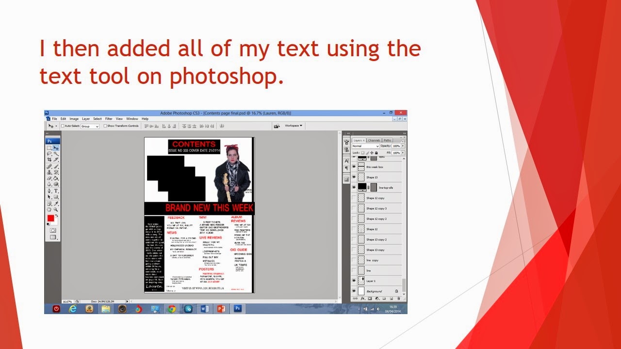
I have changed my contents page by adding boxes around my different sections of my contents page. I have done this to make my contents page look more organized therefore my readers are more likely to buy it as it is easier for them to find what they want in the magazine.
Final front cover
I have changed my front cover by swapping my plug and top feature story box around. I have done this to make the front cover more organized because i have 2 similar feature story boxes and by having them together stops the cover looking confusing. I also changed the fonts of the band names to the actual logos of the bands for people to recognize and make the front cover look different rather than boring in one type of font. This will therefore make people want to buy my magazine as people may recognize the bands and want to read about them and find the magazine cover interesting so buy it and read it.
Tuesday, 4 February 2014
Third front cover draft (for marking)
From the second to the third front cover draft i have only changed one thing, the colour of the box that contains the "bands meeting fans box from white to red to help make it stand out better on the front cover as the background of my main image is white.
Wednesday, 22 January 2014
Monday, 13 January 2014
First draft of a double page spread (for marking)
This is my first attempt at a double page spread. All the images i have used are original as I took the pictures of Lauren and the other pictures at a gig, you can not see the artists face so i could use them in my double page spread. I used the painted canvas pattern on my background to give my page some texture so it doesnt look flat and used black and red colours as they are part of my colour scheme. I used red, black and white in my writing as these are the 3 colours in my colour scheme and are on my front cover and contents page.
Sunday, 12 January 2014
Tuesday, 7 January 2014
Subscribe to:
Comments (Atom)


