Sunday, 30 March 2014

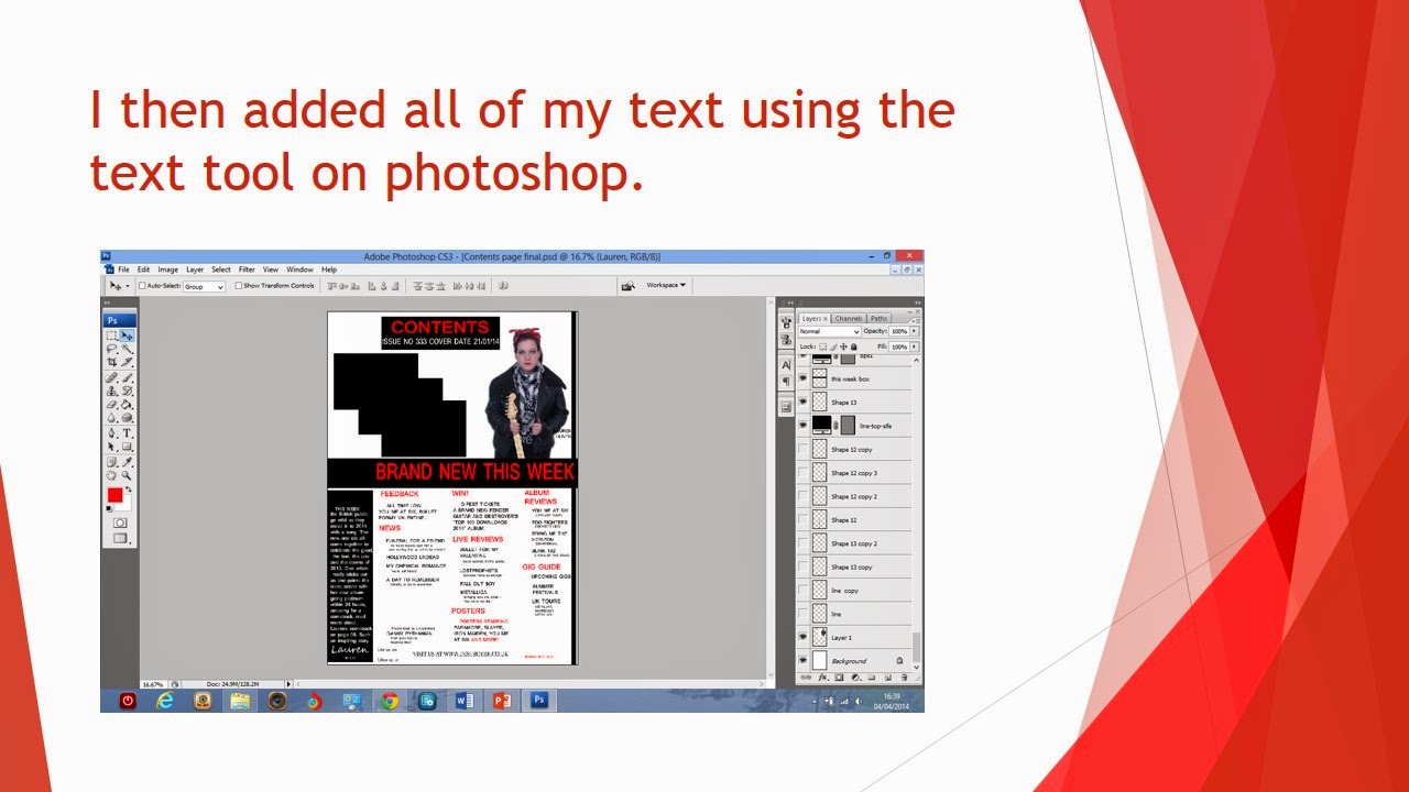
Final contents page


I have changed my contents page by adding boxes around my different sections of my contents page. I have done this to make my contents page look more organized therefore my readers are more likely to buy it as it is easier for them to find what they want in the magazine. 

Final front cover


I have changed my front cover by swapping my plug and top feature story box around. I have done this to make the front cover more organized because i have 2 similar feature story boxes and by having them together stops the cover looking confusing. I also changed the fonts of the band names to the actual logos of the bands for people to recognize and make the front cover look different rather than boring in one type of font. This will therefore make people want to buy my magazine as people may recognize the bands and want to read about them and find the magazine cover interesting so buy it and read it. 

Tuesday, 4 February 2014

Third front cover draft (for marking)


From the second to the third front cover draft i have only changed one thing, the colour of the box that contains the "bands meeting fans box from white to red to help make it stand out better on the front cover as the background of my main image is white.

Monday, 13 January 2014

First draft of a double page spread (for marking)


This is my first attempt at a double page spread. All the images i have used are original as I took the pictures of Lauren and the other pictures at a gig, you can not see the artists face so i could use them in my double page spread. I used the painted canvas pattern on my background to give my page some texture so it doesnt look flat and used black and red colours as they are part of my colour scheme. I used red, black and white in my writing as these are the 3 colours in my colour scheme and are on my front cover and contents page.